
5 Beautiful, Responsive Websites
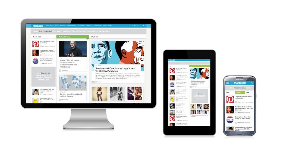
Mashable’s responsive redesign pictured on various devices. Image via Mashable.com.
After redesigning their website to scale smoothly across different platforms, Mashable.com dubbed 2013 the “Year of Responsive Web Design.” Mashable wrote that the goal of the new, fluid content wasn’t just “prettiness or technical trickery.” Rather, it was a response to a shift in the way consumers are interacting with media companies. With tablet and smartphone sales on the rise, more and more people are browsing the web on mobile devices. To keep ahead of the curve, businesses and organizations of all stripes should be “thinking responsive.”
While some companies have approached the challenge by building mobile apps, it’s nearly impossible to build an app that will function on every platform. This is where responsive design comes in. Rather than target a single platform, responsive design aims to create a website that will look and feel good across every major browser, and for any screen size.
The Mashable article does a great job explaining the fundamentals of responsive design, which include designing with “media queries,” flexible images, and fluid grids. Looking for more great examples? Check out the 5 beautiful, responsive websites listed below.
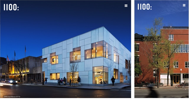
1. Studio Kudos (studiokudos.com)
Studio Kudos (NY) created this elegantly-designed WordPress site, winner of a GD USA 2014 award. The beautiful pictures tell the story of their projects, which can be enjoyed from your desktop, tablet, or mobile phone.

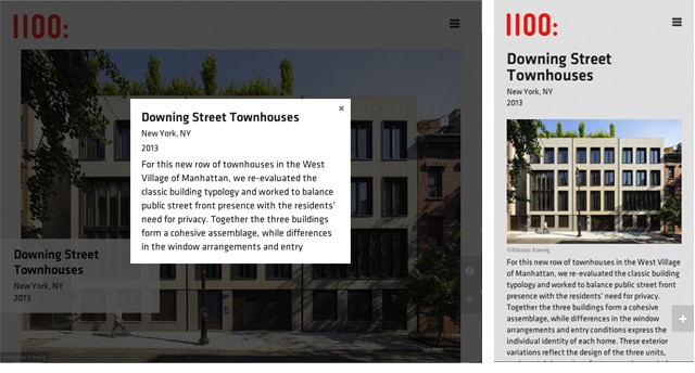
1100 Architects is a New York and Frankfurt-based firm, with a focus on sustainability and high performance design.
2. Bloomberg View (bloombergview.com)
News needs to follow wherever you are, and this nice grid-oriented layout can meet the challenge.
From the Seattle design and technology studio, Schema, the Bloomberg View website keeps the parent brand visible, but maintains their own color identity—in the logo, the use of grey tones on text, and in the light blue links. The infinite scroll grid of images and content flows nicely when you reduce the width of your window browser. On mobile view, main navigation expands from the left.
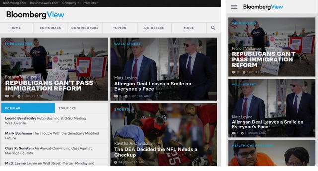
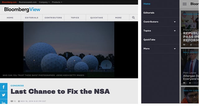
Bloomberg View is an editorial division of Bloomberg News, providing content from columnists, authors and editors about current news issues.
3. FINE Design Agency (wearefine.com)
From the design agency FINE, this beautiful website uses expansive background images that combine tradition with personality.
The menu navigation moves nicely when you change your browser window, and feels consistent across screen sizes. No matter your window size, the layout keeps a nice white space, with content flowing between images and quotes.
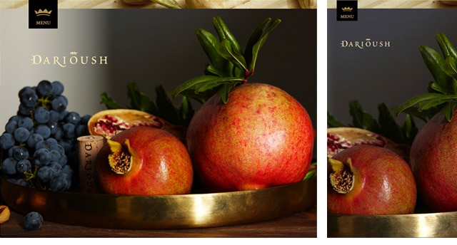
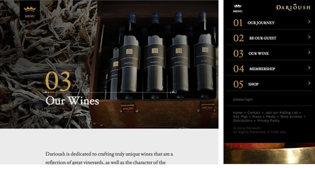
Founded in 1997, Dariush winery brings the Napa Valley style with the cultural history of winemaking in Shiraz, Iran.
4. Whitney Museum (whitney.org)
If you have an adaptable logo, why not design an adaptable site?
Change the scale of your window, or keep scrolling down, and the Whitney logo will adapt to the new view. The website is fully responsive for mobile, tablet and desktop.
This is a beautiful example of a one-tone color website, where the colors come from the artwork and not from the site backdrop.
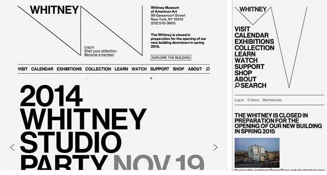
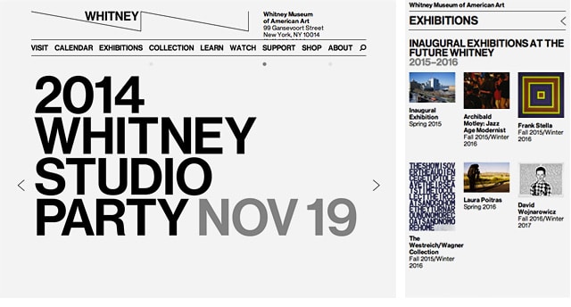
Whitney Museum is located in NY. The new identity paves the way for the museum’s 2015 move to a new building, designed by architect Renzo Piano, and situated between the High Line and the Hudson River at the Meatpacking District.
5. Smashing Magazine (smashingmagazine.com)
Learn new design techniques on-the-go or from your home. This responsive website is a must-have bookmark for any web designer. Clean vertical navigation with a hint of color that collapse down smoothly for mobile. Content is clean, with large fonts that make the site easy to read. Supportive images help break up the content, and adapt well when scaled.
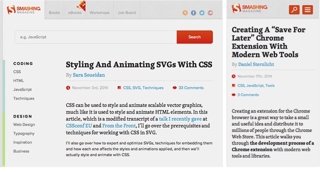
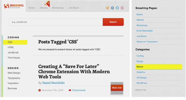
Smashing Magazine is created by their in-house team in Germany.
 This blog is powered by Sessions College, the leading online school of visual arts.


 Design Interview: Resistenza
 Minimalist Portfolio Themes for 2018
 Free Font Friday: Objective
NoD Newsletter
Enhance your inbox with our weekly newsletter.