
Monitor Calibration for Serious Creatives
by Margaret Penney | August 7, 2017
When starting out as a designer and creative it may seem like it doesn’t matter too much to calibrate your monitor. Most monitors come calibrated right out of the box so, well, they probably look fine enough, at least for a little while.
However, the more you work as a designer and develop your eye you can understand why serious designers always calibrate their monitors and suggest it to other designers to definitely do as well.
As designers, you have a few core things you explore and develop strength in as visual communicators. You work with visual concepts, typography, layout, materials.. and most importantly, you work with color. A good color palette is essential to a top quality design. So, color is not an area to guess on when working on your new favorite project.
Oftentimes, color is the special sauce that takes a design from OK to great. Color is even more important to get right when you are working in print. The color should match from screen to print as well as possible. It is futile to spend hours on a design that onscreen will resemble nothing like the final print product. So, color calibration is key.
Color Calibration on your Computer
The first step is to ensure you have calibrated the color on your monitor using the calibration tools in your OS.
- In Windows 10, you can go to System, then click Display > Advanced Display Settings > Color Calibration. Once you are there run the tool to get the best possible results. If you have two monitors you need to run it on both monitors. Matching your monitors color will also help with your workflow as you move back and forth from screen to screen.
- On MacOS, click Settings and choose Display then the Color tab and the Calibrate button.

Hardware Calibration
For accurate color matching your best bet is a hardware calibration tool. The subject of hardware calibration and optimizing monitors is in fact quite complex, for the purposes of this article I am going to focus on the most common scenario for designers who may be using a basic or medium range monitor. Here are a few options that are very good colorimeters for 2017:
Spyder5Express
The Spyder5 calibration tools are now the leading ones in use. For years, Pantone and its products were the go-to for color calibration. Now there are more options on the market and many good models from Spyder5. The Express version is a good entry calibration tool for hobbyists and will help one have consistent color across monitors and laptops, but it lacks some of the features of other Spyder models.
Spyder5Pro
The SpyderPro gives serious designers and photographers everything one needs for full-featured and advanced color accuracy. The Pro version includes advanced calibration settings for gamma, white point and gray balance, and has 16 pre-installed calibration setting choices.
Spyder5Elite
The Spyder5 Elite is for photographers, designers, and colorists and is different than the other versions because it supports unlimited calibration settings and calibrates across monitors, studio monitors, laptops, and projectors. This is the best choice of the Spyder calibration tools if you want optimal calibration and enhanced work flow.
ColorMunki Display X-Rite
The ColorMunki X-Rite is a good choice for expert amateurs and some professional designers. The best thing about this option is that its easy to set up and ensures pretty good color, it does not offer a lot of nuanced calibration options though. The price is very good though for what you are getting with this calibration tool. If you have a laptop this is considered a very good choice.
X-Rite i1Display Pro
The display pro is considered an industry standard calibrator and a professional’s choice. It uses its own exclusive technology to deliver excellent color matching results across a range of monitor types like LED, Plasma, and Wide Gamut. It is also optimized for use with Pantone Spot Colors. The drawback of this solution is that the interface may be a bit complex and it is a bit more expensive.
You can find any one of these calibration tools at Amazon or B&H Photo. Color and calibration is an interesting subject, as designers, photographers and artists you may be interested to learn more on your own. Here are some additional resources to explore:
How to Calibrate your Monitor, Digital Trends.
Monitor Calibration for Photographers, Cambridge in Color.
The Benefits of Color Calibration, PhotoFocus.
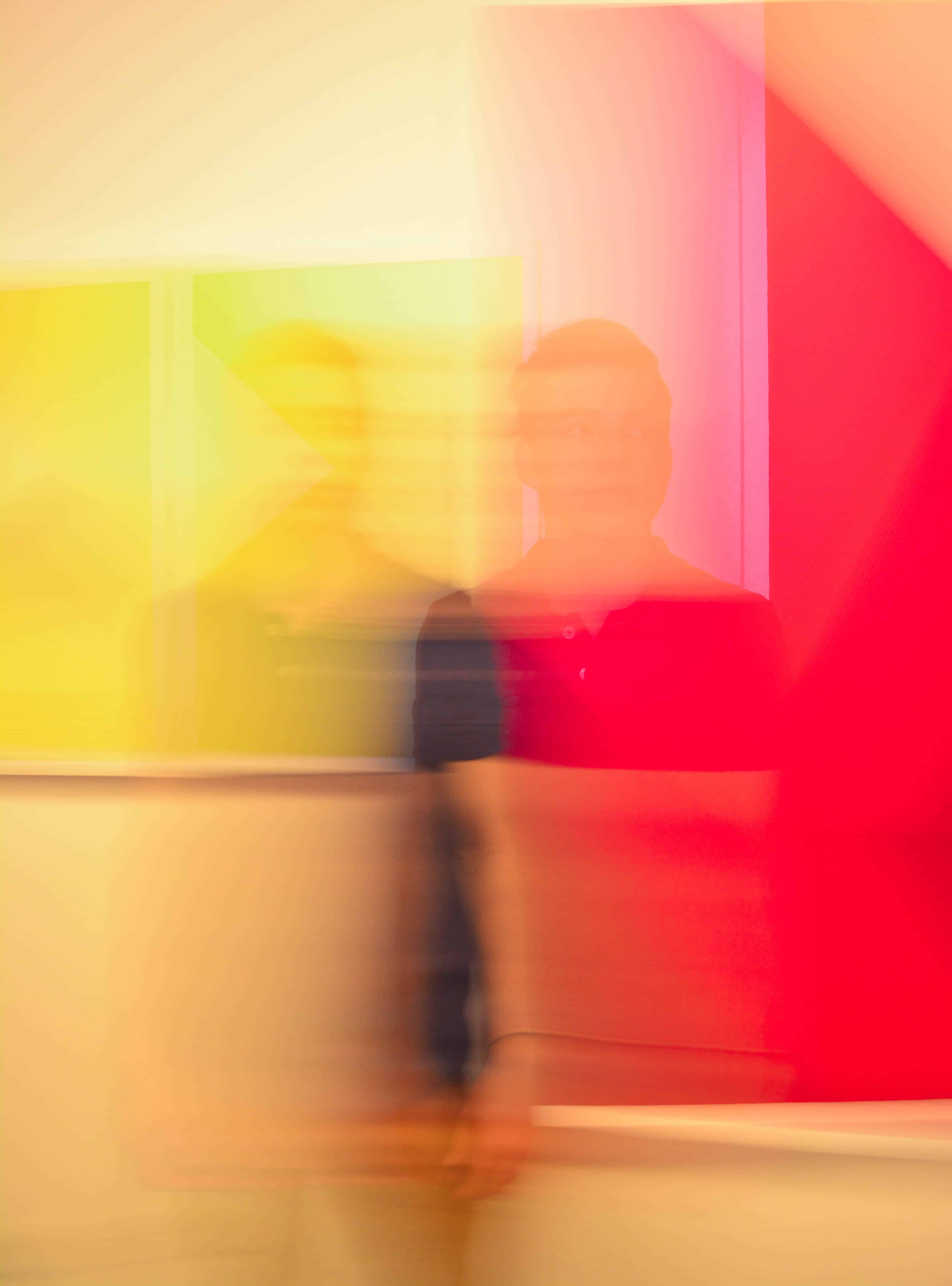
Photo for this article is by Nicolas Ladino Silva on Unsplash.

Margaret Penney is the Managing Editor of Notes on Design. Margaret is a teacher, designer, writer and new media artist and founder of Hello Creative Co.
If you are interested in learning more about using color, Sessions College offers a Color Theory course and many other graphic design courses for students at all levels. Contact Admissions for more information.


NoD Newsletter
Enhance your inbox with our weekly newsletter.