Self-Styled: Peter Tarka
Our Self-Styled series looks at innovative artists who have influenced our visual culture.
Boasting a client list that looks like a who’s who of brands you know and care about, Peter Tarka is a London-based 3D artist whose unique approach to image-making has put his work in high demand.
There’s an undeniable DNA that links all of his work together, but unlike artists who make use of a signature color palette or pattern, there’s a great deal of variety in both regards across Tarka’s body of work. The subject matter and style often vary as well, ranging from photo-realistic renderings of vehicles and scenery to highly-stylized characters.
What exactly is this elusive quality that makes a Tarka piece feel unique, and why is it so successful? Let’s take a closer look and find out.

To me, what stands out the most about Tarka’s style is his eye for composition. The way Tarka sets his scenes feels equal parts illustrative and photographic. Often placed against a solid-colored background, Tarka’s compositions function effectively as both full-page and spot illustrations, capable of reframing to fit a variety of different dimensions and applications.
This flexibility grants each individual piece significantly more utility, an approach further evidenced by the work Tarka created for Harrah’s Ak-Chin Casino. The project consists of seven different individual scenes, each functioning as a self-contained world, highlighting the Casino’s various features and amenities. The pieces also come together to form a larger picture of the hotel as a whole, with the set and all its individual pieces providing for a wide range of advertising applications.
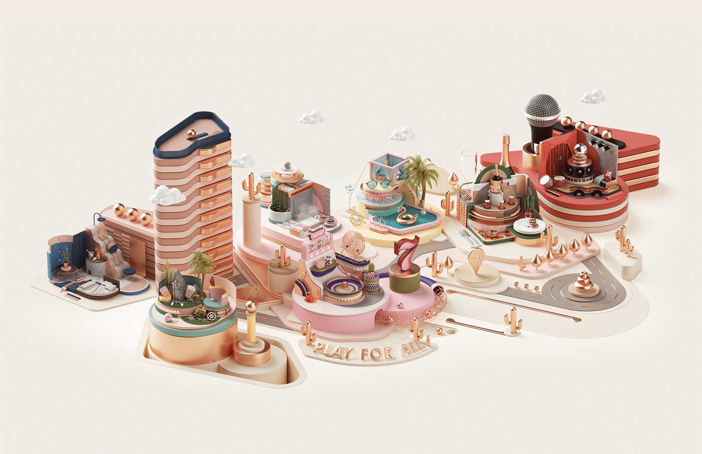
This playful and modular approach toward building his scenes is another signature quality present across all of Tarka’s work. Even when the subject matter is singular, like a shoe, watch, or car, Tarka builds out scenes around them to establish a mood or craft some sort of narrative.
In the works created for services rather than products, Tarka’s personal voice has a stronger presence. His approach toward modeling often employs primitive shapes as the basis for both the larger components within the scene and the smaller parts they house, giving the piece as a whole a quiet sense of harmony. Tarka’s use of color and material also plays an important role in establishing the work’s strong sense of visual appeal.

Had he not found illustration, Tarka might have had a great career as a toy designer. Each piece feels like a self-contained world, with every component constructed with a keen eye for detail.
Tarka’s playful and tasteful palettes and frequent use of plastic gives his works a wonderfully tactile feel as if the objects are just begging to be picked up. This sentiment extends to his more realistic scenes as well, where the elements are arranged in a way that doesn’t detract from the piece’s focus but provides just the right amount of eye candy to keep you looking at the image.
Tarka’s unique eye for composition and meticulous attention to detail allows him to transition seamlessly between realism and more stylized works with a playful voice that is equally successful in both.

Image sources: Peter Tarka
Taylor is a concept artist, graphic designer, illustrator, and Design Lead at Weirdsleep, a channel for visual identity and social media content. Read more articles by Taylor.
ENROLL IN AN ONLINE PROGRAM AT SESSIONS COLLEGE:


