
WWW… Wednesday! Huetone
by Taylor Slattery | December 20, 2021
Designing color systems can be tough. Colors for brand identities, websites, and apps not only need to look great but they need to be functional as well. To meet both of these requirements, there are a number of different factors that need to be taken into consideration. In terms of accessibility, it’s important to consider the needs of those with visual impairments, various lighting environments, and the sorts of devices that will be used to access the product. In order for colors to be successful across all of these parameters, the proper amount of contrast is necessary. But making our color choices with only contrast in mind can result in unexciting color systems that lack personality.
We need our systems to make an impression. Beyond just the literal content of our messaging, our colors are an important part of brand identity for communicating a sense of who we are and what we value. Regardless of content, visitors to a site may receive an entirely different impression of the company depending on the colors used on its homepage. This is especially true for those who are visually impaired.
While design fields like architecture and industrial design have long histories of addressing accessibility, the same can’t be said for fields that involve digital products, and much of the web reflects this. That’s changing, though. Many large companies have already made the move to adapt their color systems to be more accessible. Doing so presents a unique challenge.
Striking a balance between accessibility and purity or colors that reflect your existing brand identity or what you envision it to be is made even more difficult due to the constraints of our tools. The color systems we’re accustomed to working with in design aren’t well suited for this task. Working within RGB and CMYK color models doesn’t give us an accurate means of checking our progress, leading to a lot of guesswork.
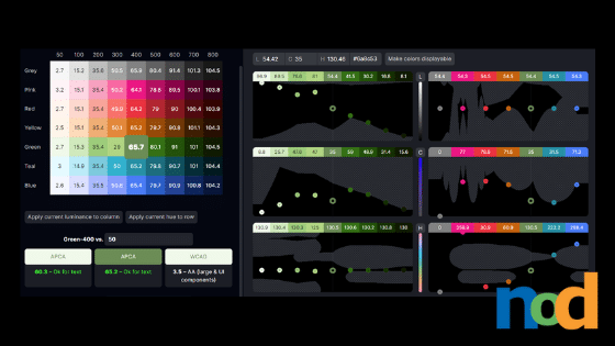
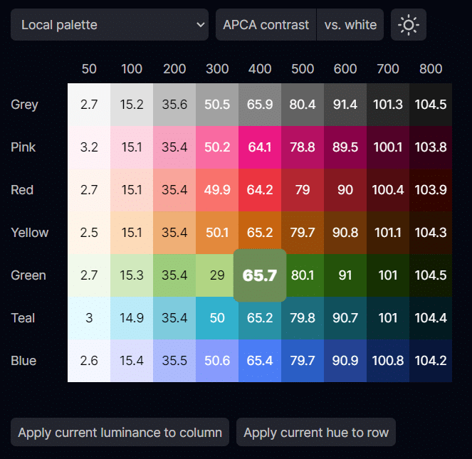
Huetone is a tool designed for building color systems with a focus on accessibility. Using L*a*b* rather than RGB or CMYK, Huetone allows users to build color palettes based on perceived lightness while measuring their choices against web accessibility guidelines in real-time. Colors are displayed in a table format with each row representing a hue and each column a set luminance value.
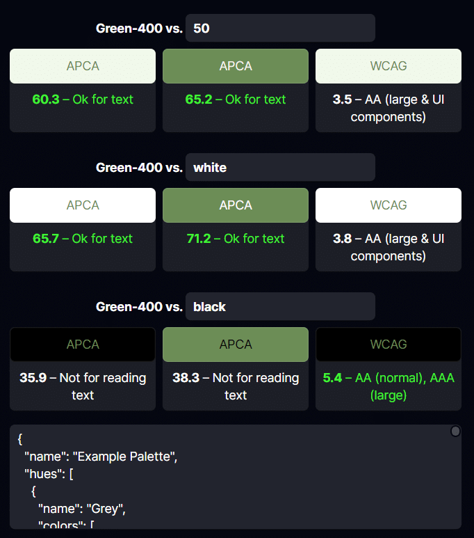
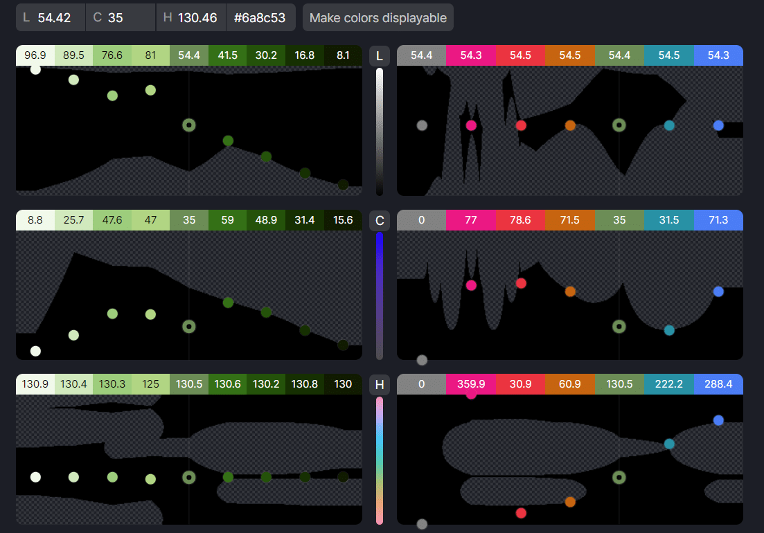
Each cell of the table can be manipulated for each L*a*b* value independently using numerical values or charts. The charts also display the possible range of options in adherence with both WCAG and APCA standards. Once you’ve finalized your palette, you can export your choices to Figma or copy the hex code for use elsewhere.
Huetone is a browser-based tool and is free to use. You can find it here.

Taylor is the Managing Editor of Notes on Design. Taylor is a graphic designer, illustrator, and Design Lead at Weirdsleep.
If you are interested in learning more about using color, Sessions College offers a Color Theory course and many other graphic design courses for students at all levels. Contact Admissions for more information.


NoD Newsletter
Enhance your inbox with our weekly newsletter.