
WWW… Wednesday! Simultaneous Multi-Device Site View with Sizzy
by Taylor Slattery | June 19, 2019
Like all great tools, Sizzy was born of necessity. Responsive web design requires a lot of switching between devices to ensure that a site will work regardless of the device used to access it. With an ever-increasing range of web-enabled devices on the market, this can mean a lot of back and forth for web designers. However, Sizzy, from web developer, Kitze, offers a simple solution.
👋 Sizzy update:
– Filter by OS (Apple, Android)
– Filter by device type (Phone, Tablet)📻 Stay tuned for more cool stuff! pic.twitter.com/YA7bZITqEE
— kitze 🚀 (@thekitze) April 27, 2017
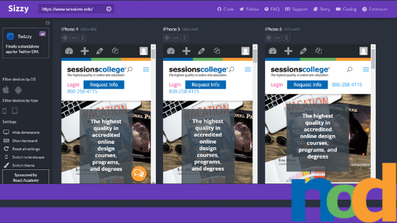
Sizzy allows for side by side site visualization across an array of devices. The service works with any site. Simply enter the URL and select the devices you would like to view it on. Devices can be filtered by operating system or device type, and a healthy mix of both Android and iOS phones and tablets are available. In addition, you can see what it looks like when the orientation is switched to landscape, or when the keyboard is active on screen.
In its most recent update, a Chrome extension was made available, which you can find here, or check out the browser-based version here.

Taylor is the Managing Editor of Notes on Design. Taylor is a graphic designer, illustrator, and Design Lead at Weirdsleep.
 This blog is powered by Sessions College, the leading online school of visual arts.


NoD Newsletter
Enhance your inbox with our weekly newsletter.