Free Font Friday: Grandstander

Our Free Font Friday series profiles the design characteristics of today’s free downloadable typefaces.
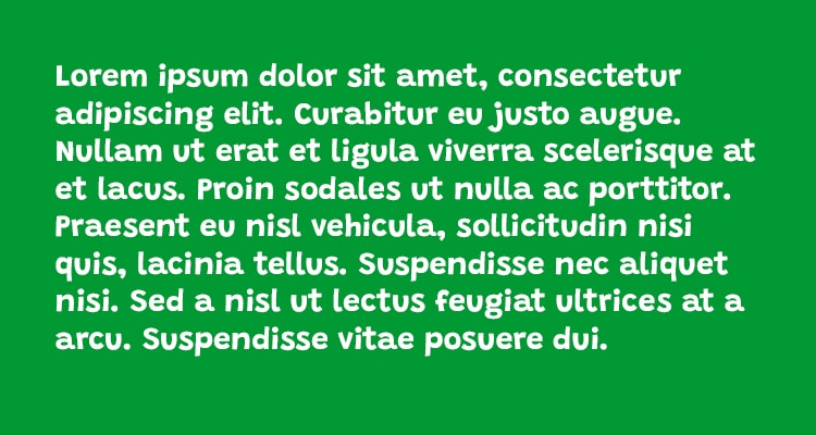
Grandstander is a display font created by Tyler Finck. It’s got a fun, off-kilter presence that piques your curiosity and makes you want to read more. It feels a bit like something you might see on the packaging of novelty kitchenware aimed at millennials or a greeting card featuring a snarky grandma.
It feels self-important but in a sarcastic way. Slight variations in its letterforms help to make it feel more human and relatable, with some interesting choices mixed in for fun.
Some of the letterforms, the uppercase A, in particular, look strange in mixed case use but make sense when surrounded by other uppercase letters, which should come as no surprise seeing as Grandstander is a display typeface.
True to its name, Grandstander is certainly an attention-grabber. In addition to its quirky personality, it’s also flexible to boot. Not only does it come in 9 different weights, with both italic and regular versions at each, but also features two variable axes, both italic and weight, so regardless of your use case, you can custom-tailor it to your needs. Its personality also takes on different feels at different weights.
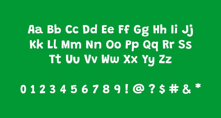
Up until now, I’ve been referring to Grandstander’s heavier weights, but at lighter weights, some of its exaggerated quirks are significantly more subtle and it becomes an entirely usable handwritten typeface.
With a host of ligatures and alternates, as well as two variable axes, you’re bound to find a use for it. You can find Grandstander for free here.

Taylor is a concept artist, graphic designer, illustrator, and Design Lead at Weirdsleep, a channel for visual identity and social media content. Read more articles by Taylor.
RELATED ARTICLES:


SESSIONS NEWS:

ENROLL IN AN ONLINE PROGRAM AT SESSIONS COLLEGE: