
Value: How Lighting Communicates Form
by Taylor Slattery | August 10, 2020

When you think of value in the context of art, what comes to mind? The exorbitant prices fetched by blue-chip pieces moving through places like Christie’s and Sotheby’s? Or maybe it’s the connection you experience with a piece on a subjective level? Both are fair, but today I want to talk about a different kind of value within art. The value by which the different shapes are composed, light is organized, and form is communicated.
Value is the conductor of the composition. It provides the structure to which other techniques can be applied for creative effect. Without a solid foundation, no amount of brushwork or creative color use can prevent a piece from feeling… off.
Value is all we need to communicate lighting, texture, and form. Within the realm of realism, value is the most essential element of a drawing or painting. You can strip a piece of its color and its edges, but as long as its values are strong we have all the information we need to understand what we’re looking at.

Here’s a picture of a girl with an elephant. Let’s remove the color.

You can see that even without color, we are still able to understand what we’re looking at. Let’s take it a step further by softening the edges.

Despite greatly reducing the detail, we’re still able to discern a girl and an elephant. The protrusions of the brow, nose, and lips cast very distinct shadows. Through repeated exposure, we’re programmed to recognize these shadow shapes and various silhouettes. This is why we can recognize things and people even from a distance. Although most people wouldn’t be able to explain why, it’s something we as humans understand on an unconscious level. This is also why, when drawing a portrait or figure, we sometimes feel like something is off, though we can’t quite pinpoint the culprit. Our unconscious mind possesses an intimate understanding of proportions and can detect when something is wrong, despite our inability to reproduce them on command. This is also why no matter how much detail you add to a piece, if the value structure isn’t solid, it will always feel broken. Here’s another picture to further illustrate this point.

I’ve blurred the picture and reduced its values almost to the point of abstraction, yet we still have enough information to understand that this is a portrait of a woman. Despite the shadows of her face, hair, and dress being compressed into a single, connected form, we can still understand where one stops and the other begins. This is because of the way the values are organized. Also notice the simplified shadow shapes of the eyes, mouth, and nose.
In the future, we’ll get into the specifics of how and why value structures work, but I felt it was necessary to show how little you need to communicate form. This is why fundamentals are taught in drawing, rather than painting. Adding color to the equation only further complicates the matter. It’s much easier to learn value using just a pencil.
That’s all for this first installation, but I’ll leave you with a tip: while you’re drawing or painting, a good way to check the success of your values is by squinting your eyes. Like the blurry picture above, by reducing the visual information, we can assess the effectiveness of our value structure.
Taylor is the Managing Editor of Notes on Design. Taylor is a graphic designer, illustrator, and Design Lead at Weirdsleep.


 Design Interview: Resistenza
 Minimalist Portfolio Themes for 2018
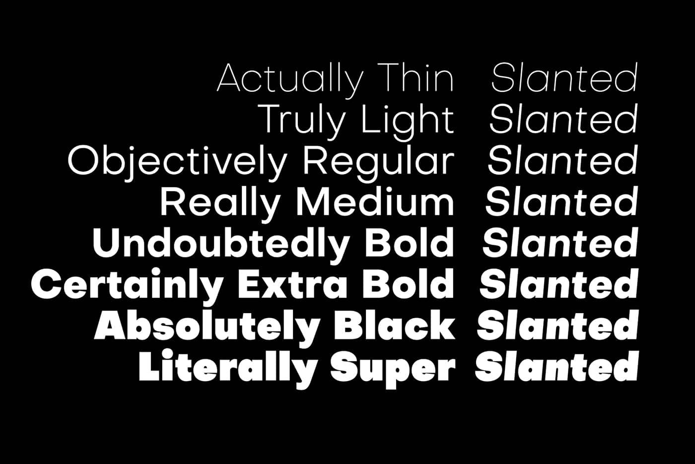 Free Font Friday: Objective
NoD Newsletter
Enhance your inbox with our weekly newsletter.