
Design Interview: Resistenza
by Margaret Penney | February 1, 2018
Resistenzia is a design and typography team with a distinct visual style that draws from their diverse cultural backgrounds. Resistenzia’s type designs succeed at taking classical influences and reinterpreting them in new and fresh ways. I am a fan of their work and wanted to ask them a few questions to learn more about their process.
Can you tell us a little about your team? How did you meet and start working together?
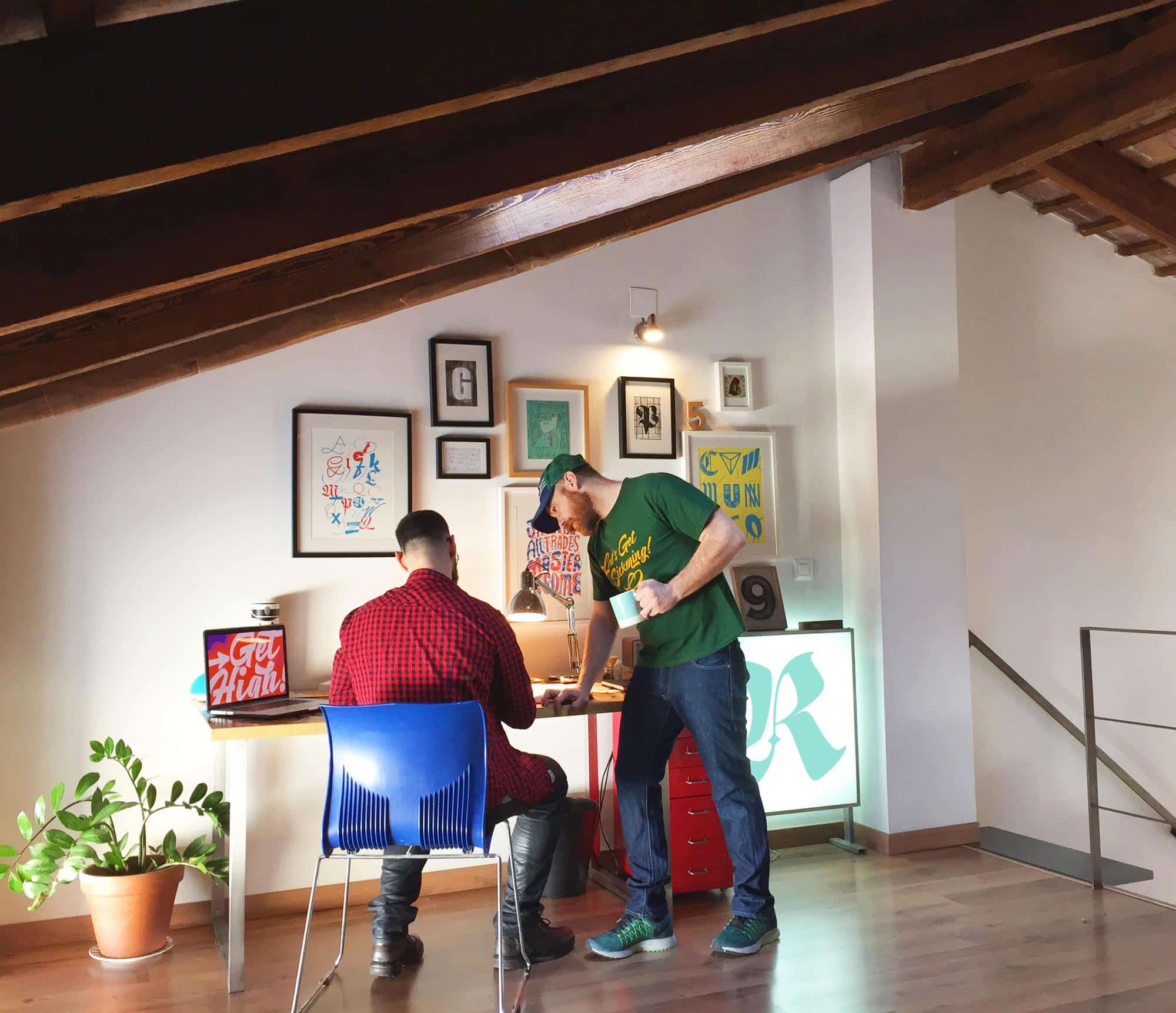
We are Giuseppe Salerno and Paco González from Italy and Spain respectively. We had a personal and business for almost 11 years. We began working on small projects and slowly we grow up our own foundry. The recipe works and the fact of belonging to two different nationalities adds even more flavors to our design. Both countries have strong heritages for falling in love with the use of letters. We basically started doing some branding projects, logos, and packaging, and slowly we focused on the creation of letters.
How did you come up with your name?
Resistenza means resistance. We wanted a strong name that expressed strength and stability. Good graphic design should be resistant.
Your type designs are diverse in influence and visual look, yet also appear very current and stylish. How do you come up with ideas for your type designs?
Most of our research is based on calligraphy / drawing practice and inspirations from signs, lettering, old books, and whatever is related with the use of letters. We have a lot of boxes with test and proofs of ideas that we came out with during our trips and our process, we like to explore diverse paths and styles.

I also see a classical interest and influence in your work. In particular with the calligraphic type projects. Can you tell us a little about your classical influence and more traditional inspiration points?
Giuseppe took part in calligraphy classes when he was a kid. These classes really changed his vision in the world of graphic design and calligraphy composition. We often get inspired and fascinated by stone carving, neon signs, and old printed documents. The use of letters and architecture is astonishing in both of our countries (Italy and Spain).

How did you get your start working in design and more specifically typographic design?
Our first typographic project was Afrobeat Font, a display font inspired by African masks and optical shapes. Designing all the glyphs was an exhausting task and at the same time it was exciting to see how your own font was growing up. Afrobeat was a best seller – Reebok used the license for a line of sneakers. This project gave us some spice and made us a bit more secure and confident in what we were designing.

You mention you have a gypsy-like existence — where have you worked and where are you now? How did you find clients all over Europe?
We both lived in different places, Amsterdam, Berlin, Madrid, USA, and right now we are mostly in Spain or Italy but always ready to pack and go anywhere if there’s an interesting project to work on.
We really enjoy getting lost in cities… we always find something to take with us, and many times a simple sign can inspire us to make a new character set. The number of things you learn during your trips is very valuable. Every place gives us more ideas, and new approaches. The fact that we don’t have a real office has made us more flexible and we learned to work outside of our comfort zone.
What is it like to live like a digital nomad and also be a full time creative?
It’s great to have different inputs or inspirations. We think this digital nomad living keeps us fresh and it’s a great help to our creative process.
Not having a workspace can make things get difficult, but the good thing is that we find always a solution and try not to panic. As type designers we need to see other scripts and our research on writing scripts will be never ending.
You can still be productive, you can carry your sketchbook everywhere, and draw your ideas. Spending eight hours seated in front of a computer everyday doesn’t work for us. When you travel, you learn to collect moments instead of things. Just because you cannot carry them all, especially if you fly low-cost 🙂
What are some of your most favorite and/or successful projects?
One of our most favorite and successful projects was Mina, a moon-like script with 12 weights. We also like a most recent one Love Wins.


What do you like best about the type creation process?
Our catalogue is mostly based on script fonts, so the best part of the creation process for us is sketching. Usually working with unconventional material is surprising and and inspiring; we have a bunch of calligraphic tools that helps us to see letterform creation in different ways.
What do you have coming up in the future?
There’s a lot coming up. During the last year we have been sketching many new letterforms and now we are developing the whole character sets. There’s a new calligraphic handwritten font, one based on classic calligraphy, a very fresh decorative script, and our big project for this year will be the launching of our first text typeface, which is totally different to the work we have been delivering during these years. Also we will be working on some custom handwritten fonts and logos and collaborations with the home-decor and textile industry. Commissions are always welcome. In the new few months we will be releasing two new font families–we highly recommend to stay tuned to www.resistenza.es!

Do you have any words of wisdom to share with new design students?
Be hungry to get to know design. Respect it but do not feel afraid of it. And instead of spending your money on expensive Iced Cinnamon Lattes with a vanilla flavors; save your money for an awesome trip that will make you discover things and get to know diverse cultures.
Margaret Penney is the Managing Editor of Notes on Design. Margaret is a teacher, designer, writer and new media artist and founder of Hello Creative Co.
If you are interested in learning to use typography, Sessions College offers Basic Typography and Advanced Typography courses as well as a course in Web Typography. Contact Admissions for more information.


NoD Newsletter
Enhance your inbox with our weekly newsletter.