
Free Font Friday: Joan
by Taylor Slattery | August 4, 2022

Joan is a classy serif typeface designed by Italian UI/UX designer and type lover, Paolo Biagini. Joan takes inspiration from the work of the fifteenth-century Italian punchcutter and creator of the first italic type, Francesco Griffo. Specifically, Joan is inspired by a Roman type cut created by Griffo for Aldus Manutius. Referencing the sharp terminals and intentional serifs of its inspiration, Joan functions as Biagini’s tribute to Italian typographic style and history. Having pulled its inspiration from some of the most foundational typefaces designed for print, Joan is also best-suited for the page.
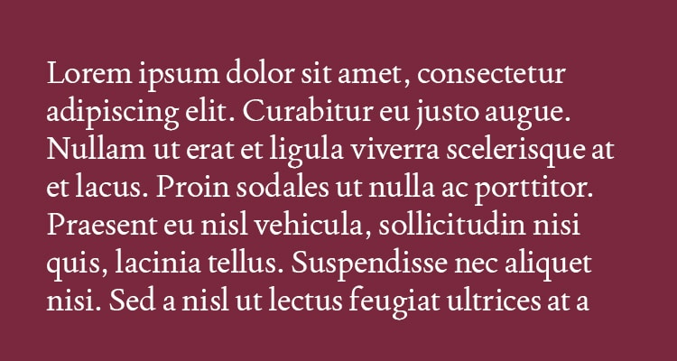
Its serifs make it particularly well-suited for print as their concise, intentional design prevents the pooling of ink, harming the type’s legibility at smaller sizes. It features generous counters and some useful ligatures that also support Joan’s utility in print. Its strokes are high contrast and its smaller x-height matches its intended purpose. While it is true that typefaces with larger x-heights are popular for use on screen, where responsive design employs modular layouts to accommodate visitors across a range of devices and screen sizes, when designing for print, taller x-heights can actually harm readability at smaller sizes by decreasing the perceived space between lines. Joan’s smaller x-height gives its ascenders and descenders adequate space to do their thing, resulting in a more comfortable reading experience for longer passages of text, like books or magazines.

Joan is available in one weight. You can find it for free here.

Taylor is the Managing Editor of Notes on Design. Taylor is a graphic designer, illustrator, and Design Lead at Weirdsleep.


NoD Newsletter
Enhance your inbox with our weekly newsletter.