
Line Control 3: Using Line to Communicate Lighting
by Taylor Slattery | October 10, 2019
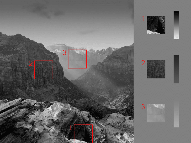
In part 2, we discussed how we can use different line weights to alter their position along the z-axis. This technique was predicated on a function of light. Due to the atmosphere’s ability to reflect light, we were able to observe that as objects move away from us, their overall value range decreases and they appear to be lighter. In contrast, similar objects that are closer to us will appear much much darker.
Using this knowledge, we learned that by increasing the line weight, we can make our subject feel closer, and by decreasing the line weight, we can push them back further into space.
This week, we’ll explore another function of light, and how we can replicate it using line. To start, let’s first explore the concept of a lost edge. This is a technique commonly employed by painters to control their focal points and add some dynamism through texture and brushwork. Lost edges occur whenever two objects of similar value are placed next to each other. Due to their similarity, they blend together visually, and we lose the ability to differentiate their edges. This can happen with any two values, though in photography, it’s most commonly seen with extreme lights or darks.
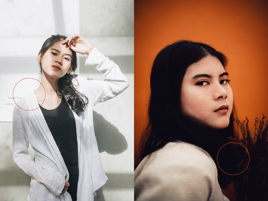
In the two photographs above, we see two such examples. In the strong sunlight on the left, the value of the sweater and the poster on the wall behind it are so close they begin to merge. The same can be seen on the right where the hair and flowers bleed into one shape.
So how can we use this new information to inform our line drawings? Just like we did in part 2, we’ll make use of line weight. Let’s start with this drawing here and add some lighting.
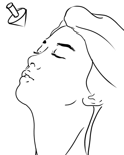
We’ll pretend as though there’s a strong sunlight coming down from the upper left, as indicated by the arrow. Next, I’ll lose the line in the parts of the face that would most strongly receive that light, and I’ll darken the line in the parts where the form turns away and light wouldn’t reach.
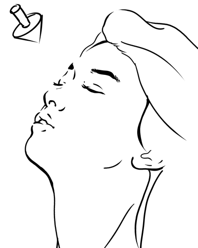
By doing so, we’re able to imply some subtle lighting and create a more dynamic drawing. In this case, less really is more. The next time you’re working on a line drawing, rather adding detail, consider subtracting.
Taylor is the Managing Editor of Notes on Design. Taylor is a graphic designer, illustrator, and Design Lead at Weirdsleep.
Are you interested in stretching your photography skills? Sessions College offers a wide range of online photography courses as well as digital photography degree and certificate programs. Contact Admissions for more information.


NoD Newsletter
Enhance your inbox with our weekly newsletter.