
Color Series: Exercising Restraint
by Taylor Slattery | February 8, 2022
In the last installation of this series, we explored the concept of gamut masks. By overlaying simple geometric shapes like triangles or squares over the color wheel and restricting our color choices to only those that fall within, we can ensure a certain degree of color harmony. We also observed how the color schemes explored in another previous installation, like complementary, analogous, and triadic, are naturally present within a gamut mask, with the added benefit of access to all of the colors that fall between.
We also briefly touched on the idea of how altering the lengths of the sides of our mask can change the relationships between the colors at its points. We’ll now explore this topic in further depth as well as how we can use the shapes of our masks to establish a natural hierarchy within our palette.
Achieving balance in any piece, be that design or illustration, is all about managing contrast. At the beginning, we decide where we would like our focal point to be, and then, in a systematic way, we work through the various types of contrast using each to reinforce our message. Balance is achieved through the degree to which we allow each type of contrast to draw attention. Some types of contrast will act as the stars of the show, with others relegated to a supporting role, and some not making much of an appearance at all.
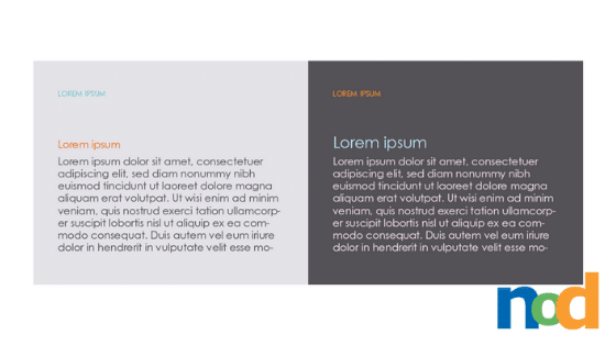
This brings us to restraint. Using multiple types of contrast in the same way, or to say the same thing can at times feel harmonic, and others, redundant. Take a look at the example below:
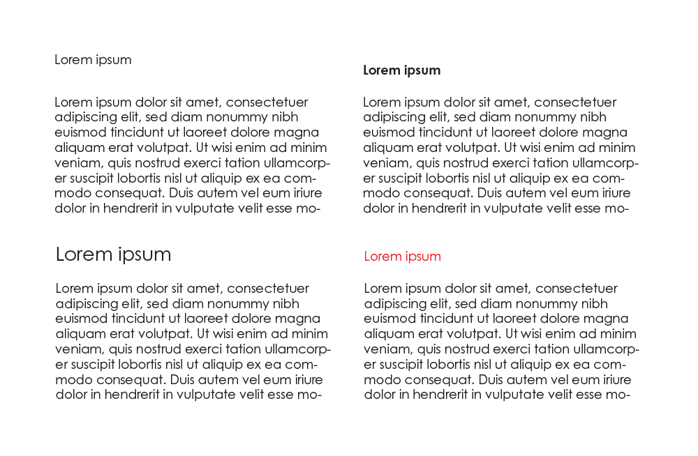
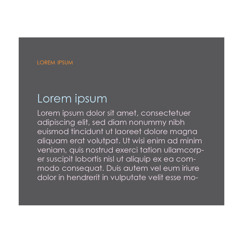
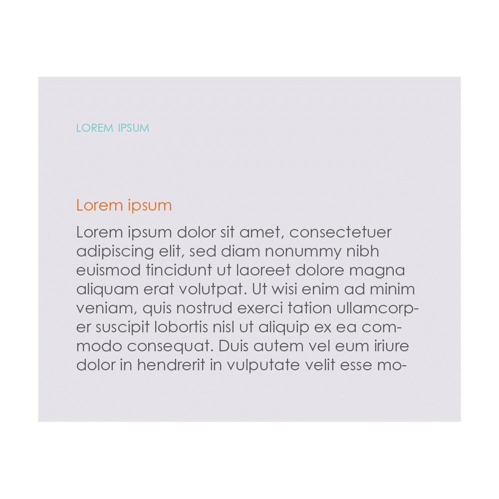
To mark the header of this body copy, we can use a few different types of contrast to give it the appropriate amount of attention while still maintaining its relation to the body copy. Distance, weight, size, or color can all be changed to achieve the desired effect. While for a simple page, just one of these is enough to achieve a sufficient level of distinction, there are more complicated cases with multiple recurring elements, each of which requires its own special styling to make it easy to recognize.
If we were to use all of these simultaneously, along with changing the typeface, the result feels too far removed and lacks the simplicity and elegance of the previous solutions. It’s important to strive for a balance in contrast that maintains cohesion, avoids redundancy, and feels decisive and confident.
The success of a piece is determined by how well these decisions work in concert with one another. As far as color is concerned, the three primary tools at our disposal are value, saturation, and temperature, with the most important of these being value. The value structure acts as the foundation. It provides a blueprint that, if designed effectively and adhered to, ensures that our color choices will work at a fundamental level, with the rest being left up to preference.
Gamut masks provide us with an easy means of managing the remaining types of color contrast: saturation and temperature. The key to this technique lies in the shape of the mask itself. Previously, I mentioned how roles are delegated in order to achieve a balance in contrast. In terms of hierarchy, you can think of these as the leading role, supporting actor, and extras. Notice how perfectly an obtuse triangle lends itself to this analogy.
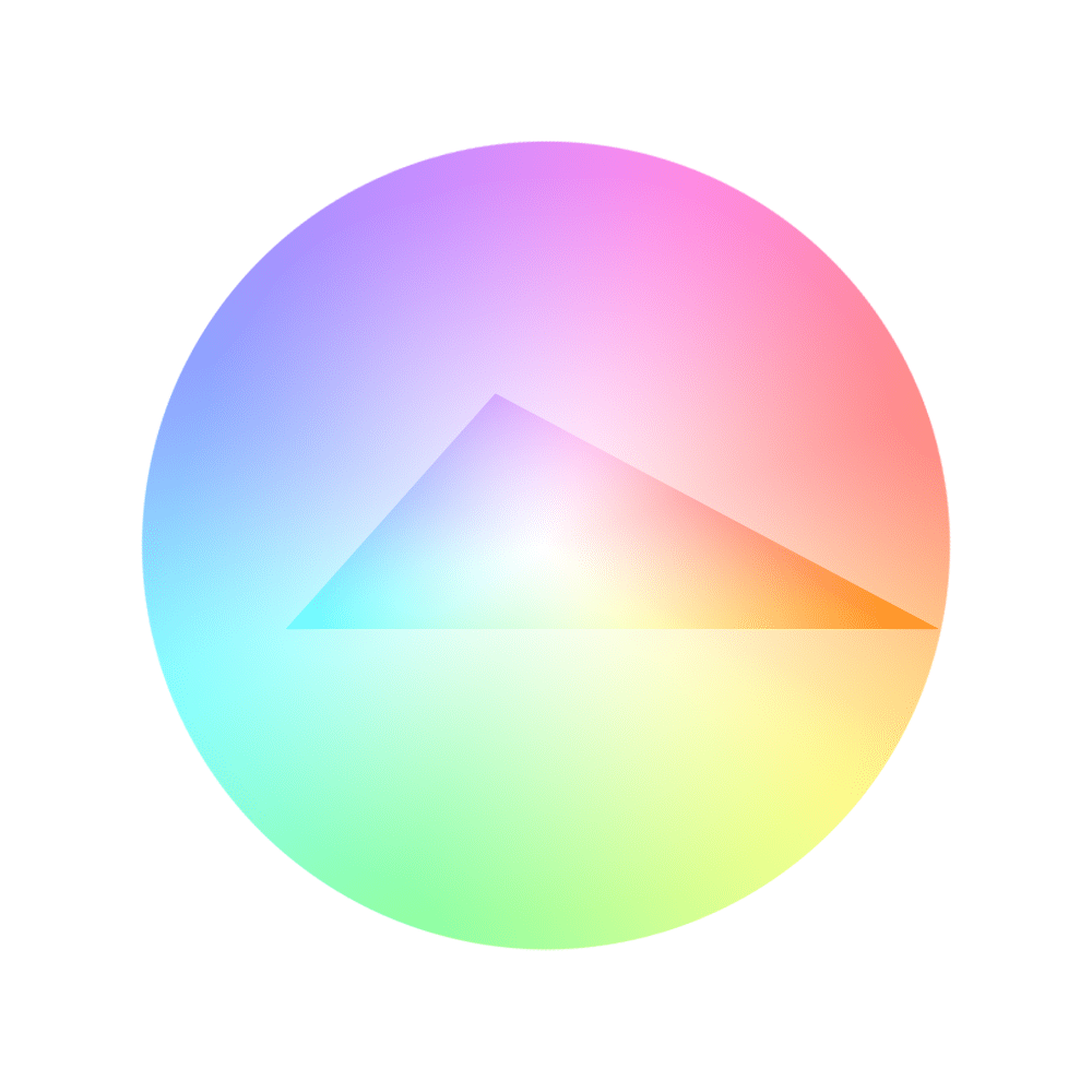
Our star of the show, a warm, saturated orange off to the right, stands in contrast to the cooler blue and purple in both saturation and temperature. Its tight, acute angle also reduces any analogous competition from neighboring hues. The blue plays the supporting role. While not as saturated as the orange, it still has more saturation than the purple, and also enjoys the similar benefits of an acute angle. The purple is desaturated and wide open, making it harder to distinguish amongst its neighboring hues. This area will act as our extras, providing the background upon which the star will shine brightest.
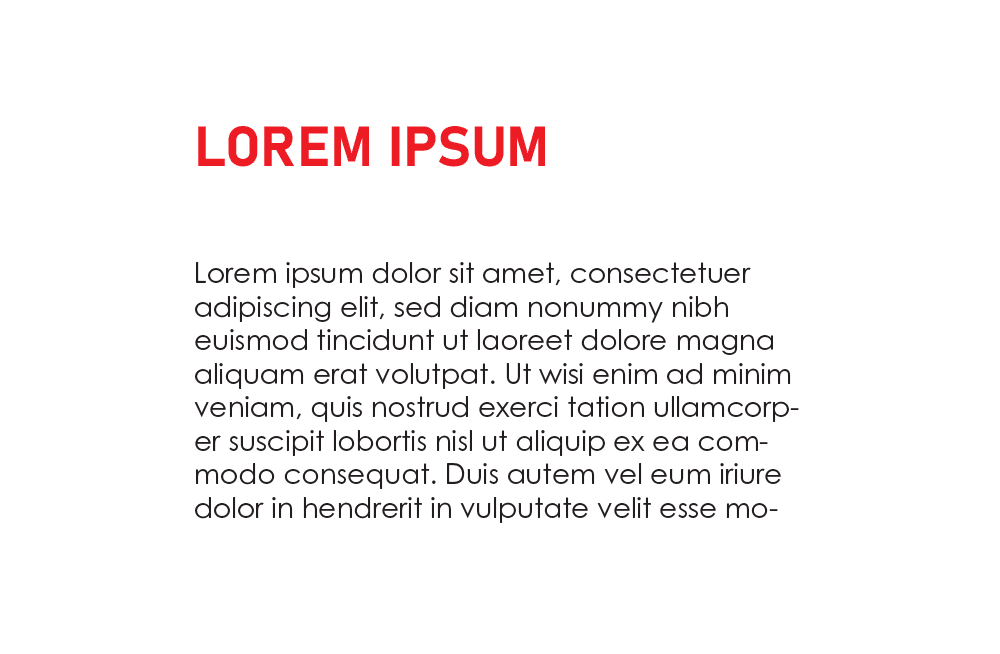
Here’s how that might look in practice using our example from before. The supporting blue is used for the header, at an increased size to help create distinction between it and the body copy. The header and body copy are more closely related through value, temperature, and proximity, making them feel connected. Up top, we have a running header at the same point size as the body copy, but in small caps. Its value is closer to the background than the other elements on the page, but its distinctive contrast in color temperature makes it easy to find without standing out too much.
Alternatively, we might make the running header relate more closely to the background, placing our supporting blue over top one of our desaturated extras. Our star orange now relates more closely in value to the body copy, but its distinctive temperature stands out enough against the background to reduce it back to its normal size. In this case, color alone is enough to bring our attention to the header.
Striking a successful balance still requires some trial and error, but with a solid value structure in place, gamut masks make the rest much easier.
Taylor is the Managing Editor of Notes on Design. Taylor is a graphic designer, illustrator, and Design Lead at Weirdsleep.
If you are interested in learning more about using color, Sessions College offers a Color Theory course and many other graphic design courses for students at all levels. Contact Admissions for more information.


NoD Newsletter
Enhance your inbox with our weekly newsletter.