New Twitter Logo ‘X’ Says Bye To Blue Bird
by Taylor Slattery | August 1, 2023

Whether people love it or hate it, the new Twitter logo rebrand is one of the biggest shake-ups in recent social media logo design history. But the implementation of this new X logo didn’t just happen overnight. The first gears of change started turning within Twitter more than a year ago, ultimately leading up to the iconic blue bird favicon being no more.
When Musk Bought Twitter
In April 2022, Elon Musk became Twitter’s largest shareholder. Shortly after that, despite the board’s best efforts to resist the sheer magnitude and brute force of Musk’s very deep pockets, Elon went on to acquire the beloved blue bird company to the tune of $44 billion.
The path to acquisition was tumultuous, to say the least. Over the course of the on-again, off-again deal, which consumed headlines for the greater part of 2022, several top executives exited Twitter, and both parties involved filed multiple lawsuits. When the deal was finally concluded in October, nearly 7 months had passed since discussions had first begun earlier that year in April.
Twitter Starts to Change
From the start, Musk championed free speech as one of his main reasons for the acquisition, tweeting, “the bird is freed” on the day of the deal’s completion. After finalizing the acquisition, Musk quickly set to work realizing the changes he had promised.
In November of 2022, he formed a Content Moderation Council with the aim of investigating previous account bans for potential reinstatements and aiding in the rollout process of Twitter Blue, Twitter’s new subscription-based verification option that quickly led to thousands of celebrity impersonators.
Musk also laid off almost half of Twitter’s workforce via email, losing an additional percentage through efforts to reduce redundancy and those who left due to the overall culture change. Both of these moves—the broad, sweeping layoffs and introduction of Twitter Blue—came as part of Musk’s efforts to reduce expenditure and turn the business cash flow positive by reducing reliance on advertisers.
While Twitter’s expenditures dropped from $4.5bn to $1.5bn, and its new subscription model is slowly gaining traction, it still remains to be seen if this new strategy will be able to do for Twitter what the previous business model couldn’t: turn a profit.

New Twitter Logo – ‘X’ Crosses Out Iconic Blue Bird
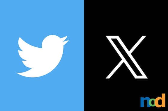
On July 23, 2023, the latest in a series of attention-grabbing controversial changes came in the form of a new Twitter logo. Gone was the ubiquitous blue bird, and in its place, a black and white Unicode ‘X’.
Musk had been using the name X Corp since the early days of the acquisition, citing the purchase of Twitter as “an accelerant for X, the everything app”, which aims to be a competitor for the China-based WeChat.
Although this rebrand should come as no surprise, as Musk is no stranger to stealing the spotlight, the rollout feels hasty, to say the least. The site feels very much under construction, with elements in various stages of transition. Twitter and X branding appear alongside each other across various touch points on the site and app, and Twitter’s iconic blue is still prominently featured throughout.
While Musk himself cites the incongruence between the original meaning of the logo, which was born during a time when tweets were limited to 140 characters, and what the platform is today, a place where users are free to post to their heart’s content, some speculate the rebrand was simply a bid to pull attention away from Twitter’s new Meta-backed competitor, Threads, which launched just weeks prior.
Musk is certainly skilled at commanding headlines, with a great deal of his success being built upon his personal brand. While it’s unclear what further changes are to come for the platform as a whole, it appears as though the X logo is here to stay.
In Conclusion, All Logos Have Meaning
For the Twitter of the past, the simple, pithy platform built on 140 characters maximums was perfectly symbolized by its blue bird mascot. Chirping notifications, tweets coming and going at all times, a cartoonish anthropomorphic brand used for greeting the world in the morning and catching up on the news at night.
But now, X! An almost literal crossing out of the past. “It’s what’s happening” acting as the new call-to-action for sideline posters and readers alike. Twitter’s signature chirp-ish bright blue color, not sliced up and seemingly graffitied over and vandalized by the new kid on the block.
All this is a stark reminder that brand landscapes are every changing for certain entities that could die the second they stop moving forward. If you’re interested to learn logo design to help tell a business’ story within a single static image, check out our parent partner Sessions College to kickstart your marketing design career today.

Taylor is the Managing Editor of Notes on Design. Taylor is a graphic designer, illustrator, and Design Lead at Weirdsleep.


